Veganna
Objective
Anna, the client, needed help creating a visual brand identity and logo for her new organization, which brings vegans together.
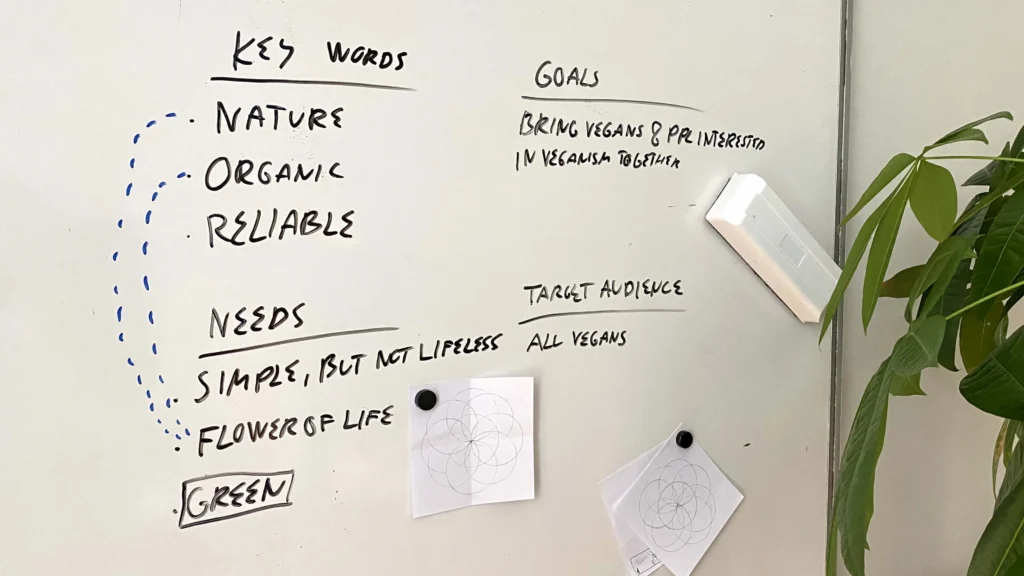
Through our conversations, we identified three key themes that represent the heart of her organization: nature, organic, and reliability. These became the foundation for the design.
The symbol
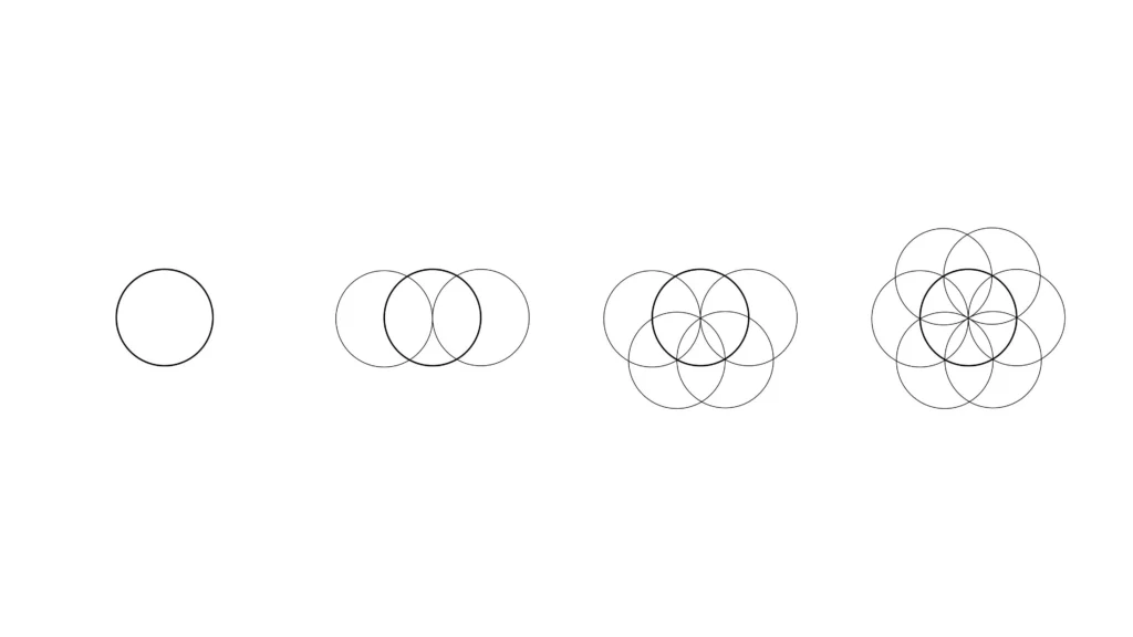
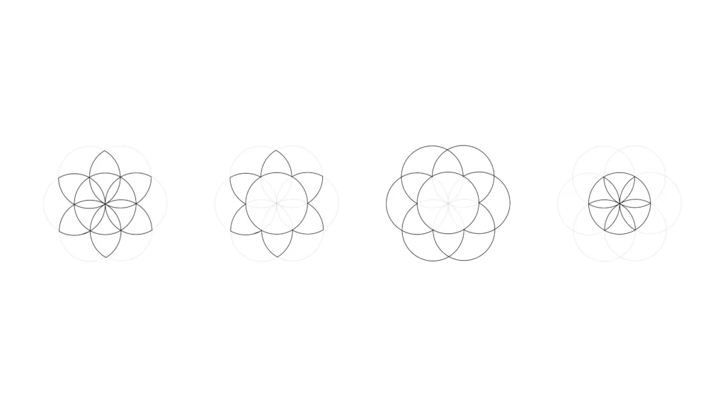
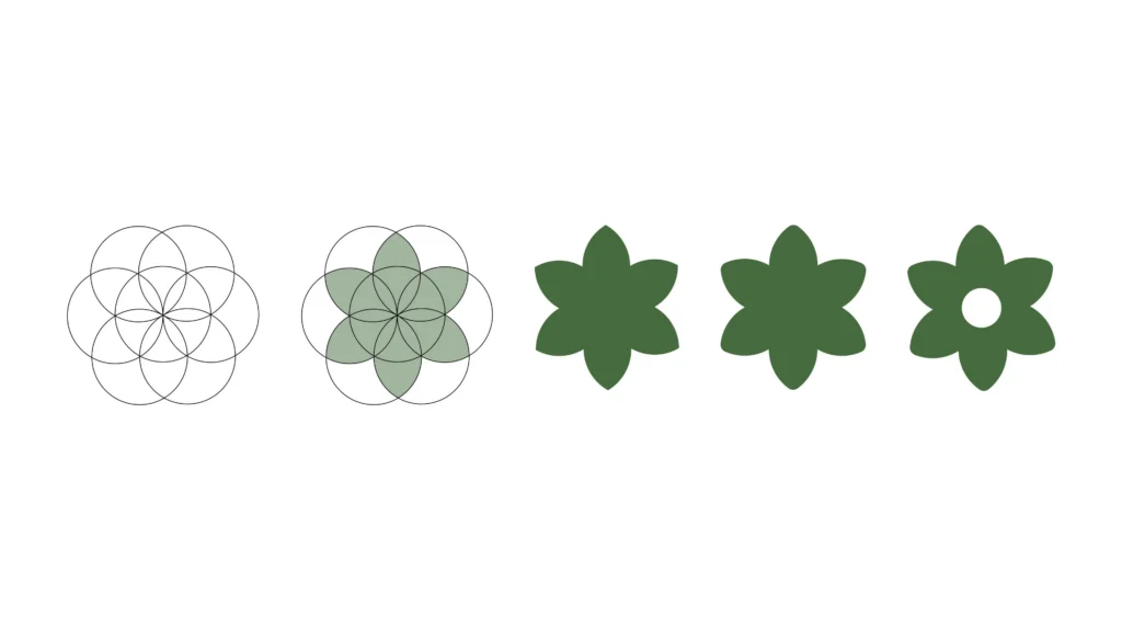
The client’s only request was to incorporate the flower of life symbol in the logo.
An ancient geometric symbol built from overlapping circles, carrying with it a sense of growth, interconnection, and natural harmony.
Symbol placement
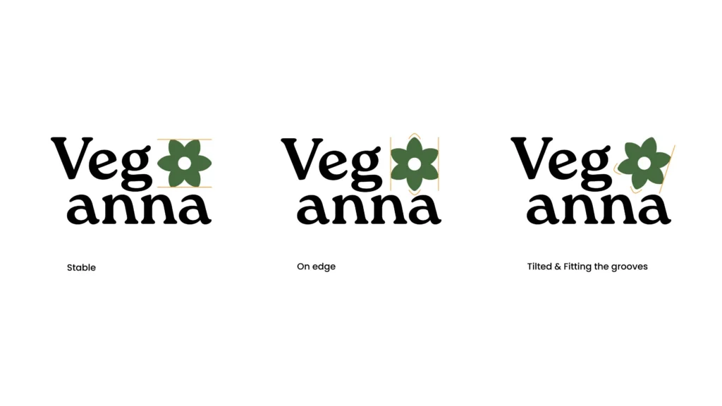
To blend the symbol seamlessly with the typeface, we explored a few different placements: In a straight, centered position, it felt reliable, however also too stiff and lifeless.
Rotated on its edge, it came across as unstable, which didn’t feel right either.
The final version was rotated just enough to align with the curves of the typography. This gave it a sense of movement and life, while still feeling grounded and trustworthy.
Colour Palette
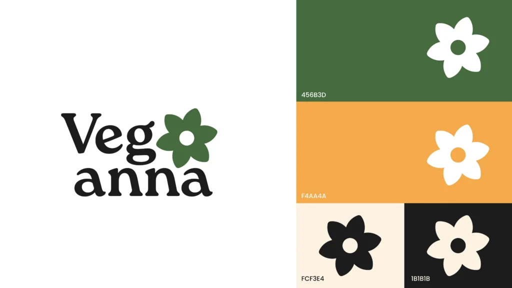
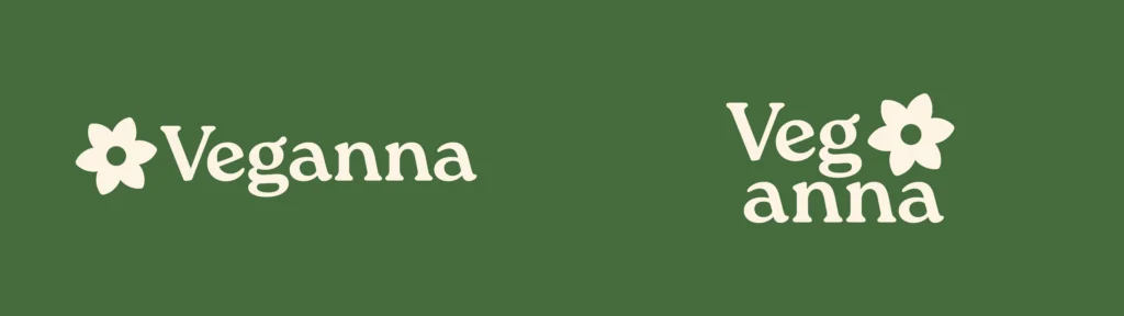
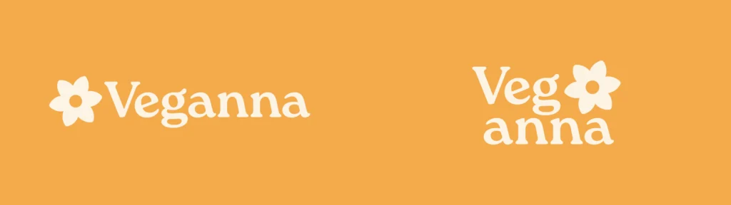
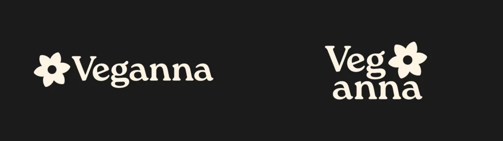
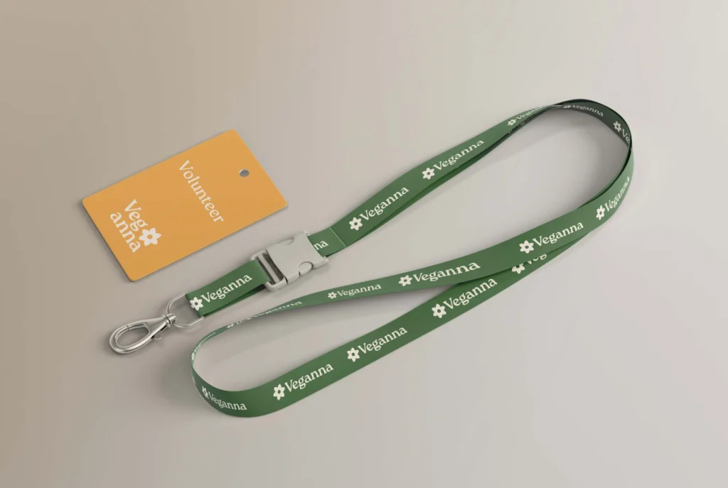
The colour choices: green, orange, beige white, and dark grey, were carefully selected to reflect Veganna’s connection to nature and sustainability.
The primary green gives an earthy, organic feel. Orange adds warmth and energy. Beige white softens the overall look, offering a more natural alternative to bright white. And dark grey adds a sense of balance and reliability.
Responsive logo design
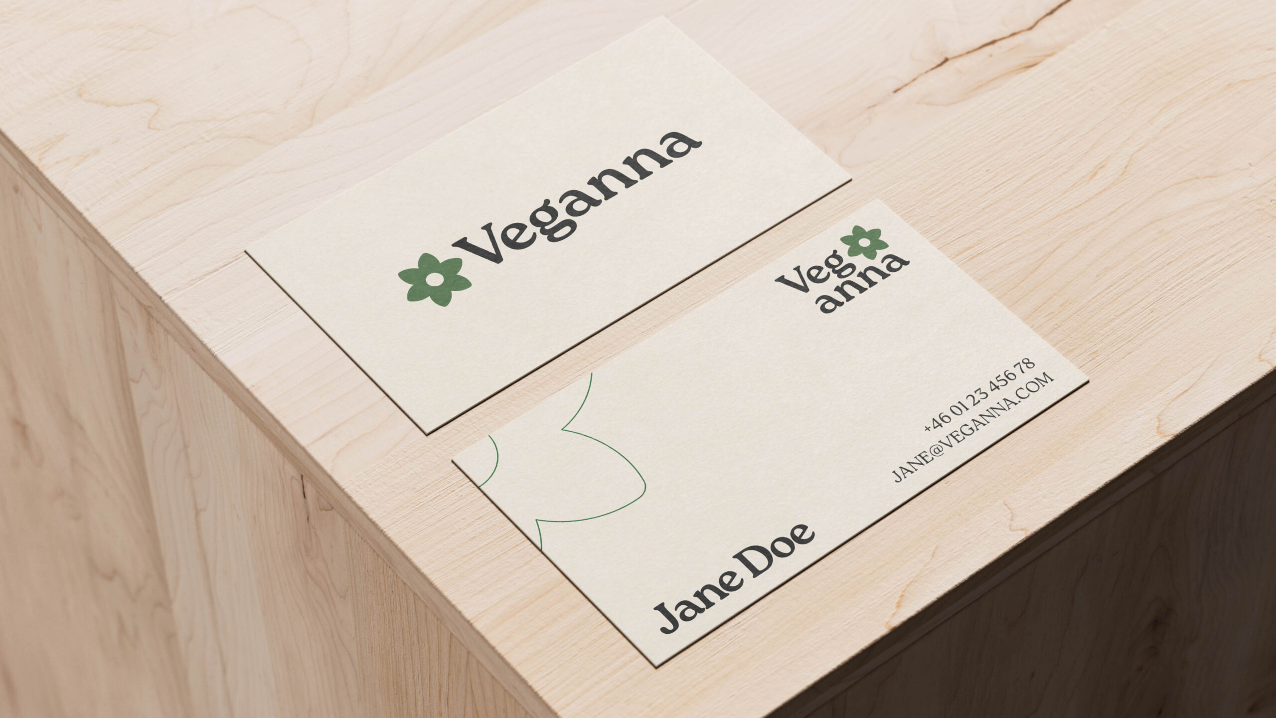
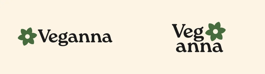
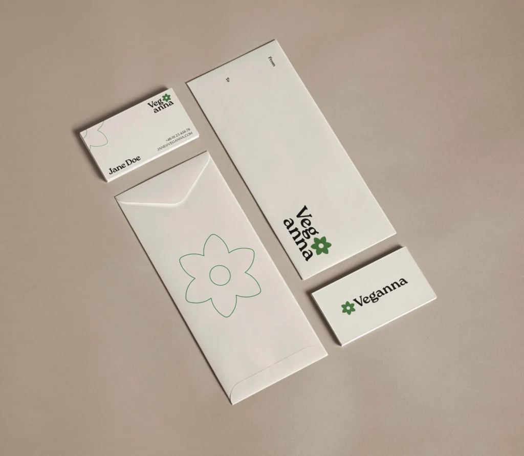
To make sure the logo works well everywhere, we created both horizontal and stacked (vertical) versions.
The horizontal version is perfect for banners, websites, and other wide layouts.
The stacked version fits better in tighter spaces like mobile screens or profile pictures.

It was a pleasure to work on my logo/brand together with Ákos. Professional, efficient, skilled and with good guidance.
I am very happy with the results!
Anna Hansson, founder of Veganna AB